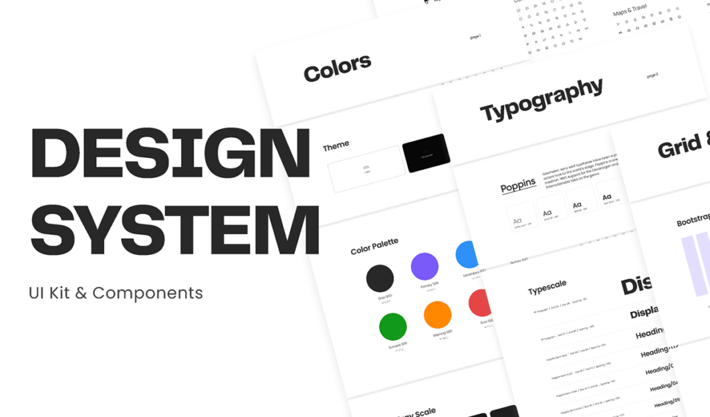
ELL - Design system
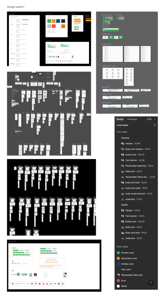
In ELL design system, I’ve created a comprehensive design system that covers the essential building blocks for ELL journey. Here’s an overview of its components:
1. Color Palette: I’ve defined a primary and secondary color scheme to ensure visual consistency across various touchpoints. The palette includes primary and accent colors, neutral shades, and state colors (e.g., success, error, warning) for clear visual cues.
2. Typography: The system includes well-defined text styles for headings, body text, captions, and links, along with typography scaling to maintain hierarchy and readability. I’ve chosen legible typefaces suitable for web and mobile screens.
3. Spacing & Layouts: To ensure responsive design, I use a flexible 12-column grid system. Spacing is standardized using an 8px baseline grid, ensuring proper alignment and consistent margins, padding, and gaps.
4. Components: Reusable UI components such as buttons, input fields, cards, modals, and navigation bars are part of the system. Each component includes multiple states (e.g., hover, active, disabled) for seamless interaction. These components help speed up the design process while maintaining uniformity.
5. Icons & Imagery: A curated set of icons is available for navigation and actions, ensuring clarity and ease of use across platforms. The system also includes guidelines on image use and alignment.
6. Accessibility: I’ve ensured that all elements meet WCAG standards, including proper contrast ratios and focus states for accessibility.
This design system is a practical, scalable resource that supports both designers and developers, fostering efficiency and a consistent user experience across products.